Benchmarking the world's largest public fund
The brief
Where this started
The Public Investment Fund's new channel website was a critical touchpoint for investors, government stakeholders and the public, but there was no structured usability evidence behind it. I was tasked with a benchmarking study to evaluate the platform against international standards and user expectations.
The friction
What was getting in the way
No clear usability insights for a high-stakes public platform.
A need to identify UX gaps systematically, not anecdotally.
Recommendations had to align with the organization's strategic digital presence.
The response
What we built instead
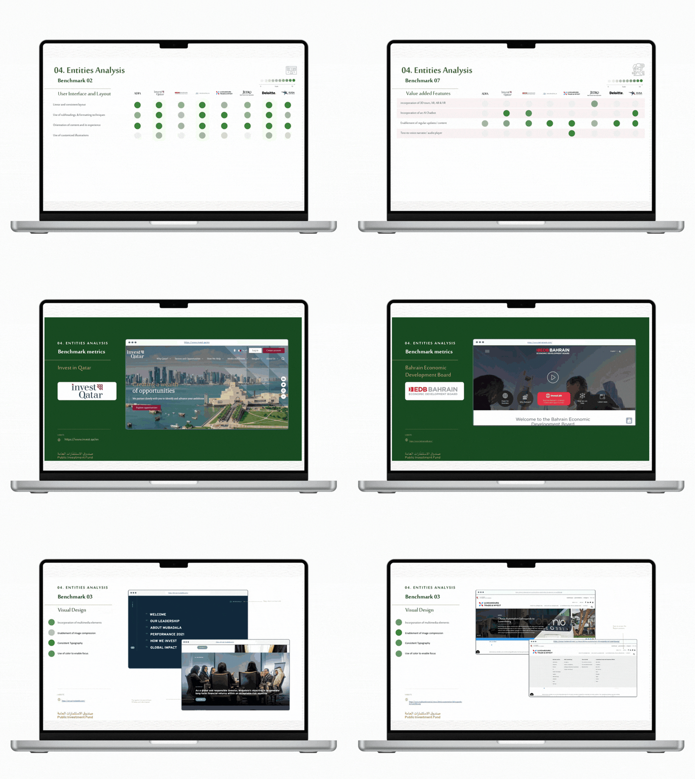
A comprehensive UX benchmarking report built on a 9-pillar evaluation framework tailored to the platform: usability, accessibility, navigation, content clarity, performance and trust among them.
Comparative analysis against eight peer public-sector fund websites worldwide.
The method
How the evidence led there
Framework design
nine custom evaluation pillars grounded in the organization's context and international UX standards.
Comparative analysis
selected eight peer public-sector organizations worldwide as benchmarks.
Cognitive walkthroughs
systematic task-based evaluation to surface usability loopholes under each pillar.
Reporting
findings compiled into a report of critical gaps and actionable recommendations.
The result
What changed
A data-backed benchmark exposing gaps across navigation, content clarity and accessibility.
Actionable recommendations to improve trust, usability and overall digital experience.
Alignment with global best practices for public-sector communication.
A scalable benchmarking model reusable for future digital properties.
Why it matters: Competitor analysis, evaluation frameworks and evidence-first recommendations: the research discipline that keeps continuous improvement honest.
Full walkthrough deck, Miro boards and Figma prototypes available on request (NDA-protected). Get in touch.